Solving the Dilemma of Design Thinking
Are the visualization approaches designers use a conscious choice?
I was at the Design School the other day at Cornell University and I had the opportunity to leisurely walk around their amazing spaces. Aside from the many bleeding-edge technologies that are now part of the design experience, I had the chance to see many student and faculty projects—from a new generation of internally-regulated uniforms for firefighters to 3D body scanning technologies to the newest array of design fabrics for wearable technology.
What was most interesting to me was to see the many completed projects at their point of origin: in concept. It was fascinating to see the finished or prototype product and then to see the concept drawings at that moment when the idea was taking root in the designer or at the moment when they were solving real design challenges during its inception. Here's just a few of the concept drawings I saw around the halls: 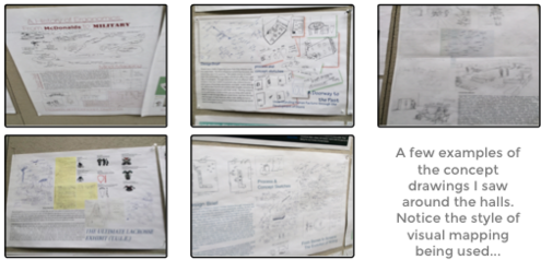
One of the things that was striking to me (and I see this same phenomenon in K-12 schools all the time), was the type of visual mappings that budding designers were using. For many people, I imagine that a visual map is a visual map—there's not much distinction between one type of concept map and another. But for those of us who are nerdy enough to study such maps and analyze their pros and cons, the types of maps people choose to visualize their ideas are fascinating. Two reasons:
- First, I think it's fascinating because—like Edward Tufte's work on the detrimental cognitive style of PowerPoint—a seemingly innocuous approach like PowerPoint or visual mapping can weave its way into our lives without our permission, become popular without our endorsement, and teach us how to think without our consent.
- Second, I think it's fascinating because so few people realize that their thinking is being influenced (and in most cases negatively biased) by the structure of the mapping technique itself, even before they start mapping their ideas.
There are numerous problems with these two styles of conceptual maps, most of which stem from their faulty assumptions about cognition (how the brain thinks). Buzanian mind maps, for example, are simple to use and the various software programs available are easy to learn. This simplicity is in large part the reason for their popularity, I suspect. At the same time, Buzan's mind maps wreak havoc on our cognitive habits because they falsely presume that cognition is: (1) entirely hierarchical, and (2) radial (starting from a central point and radiating outward). In contrast, Novakian concept maps are far better but they lead to a cognitive disorder I like to think of as "brain splat." The effects we have seen in people young and old alike are quite detrimental, leading us away from systemic thought, creativity, deep analytical thinking, and usefully structured thought. So much so that I invented a fictitious brain disorder: Brain Rot Disorder (BRD). I imagine that the advertisement goes something like this:
If you're visualizing your ideas using mind maps, you may be doing permanent damage to your brain. How does usage of Mind Maps lead to Brain Rot Disorder (BRD)? The problem with Mind Maps is that the underlying "science" is based on two flawed ideas about your mind: (1) your mind thinks only hierarchically, and (2) your mind thinks only in a "radial" way (e.g., all thinking "radiates" out from a single idea). As you use mind maps, you reinforce "bad habits," burning neural pathways which eventually become "the way you think" and can ultimately lead to systemic idea-death. The truth is that your mind doesn't work this way--it naturally works like a systemic network similar to the internet or other complex systems like ecologies, society, or social dynamics at a party. MetaMaps thinks in the same way your mind was born to think. Switch to MetaMaps and join the fight to stamp out Brain Rot Disorder forever.
All the pros and cons aside, the best way to demonstrate the differences between things is to show them. So, I decided to invent a simple design challenge to explain the key differences between these visualization approaches. Before I do, let's review the three approaches and their underlying assumptions:
- Mind Maps (Buzan): The mind is (1) radial and (2) hierarchical
- Concept Maps (Novak): The mind thinks in (1) Elements and (2) relationships
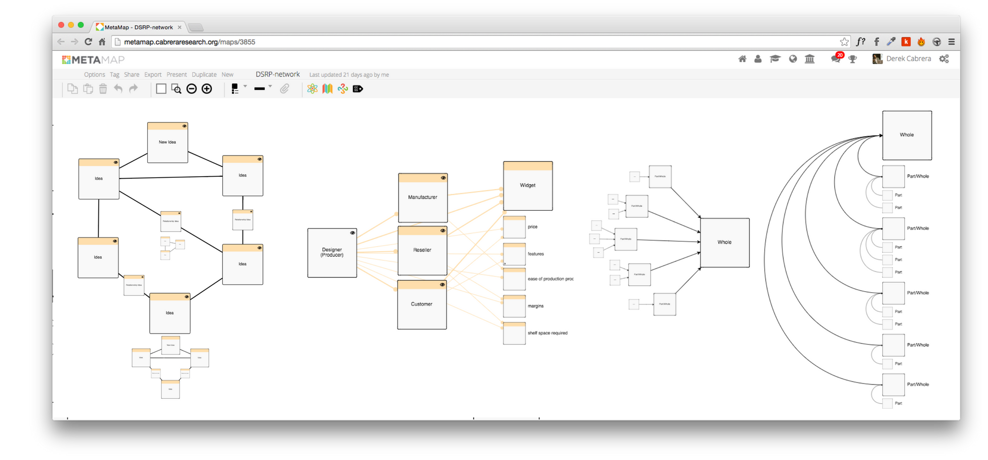
- Meta Maps (Cabrera): Cognition is (1) a complex adaptive system (CAS) (2) embodied, and (3) follows patterns of (a) Distinctions (identity-other), (b) Systems (part-whole), (c) Relationships (action-reaction), and (d) Perspectives (point-view).
The Design Challenge
So, let's establish a design challenge. Let's say that we have a situation in which a Designer needs to take 4 perspectives into account when designing a simple door hinge. How might the designer concept the hinge and the design challenge?

Now that we've thrown down the gauntlet for our pretend designer, let's take a look at how they might use these three styles of mapping to accomplish the task.
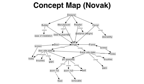
The cons are many. Because there is no visible part-whole structure in a Novakian concept map (part-whole is handled as a type of relationship like everything else) it is very difficult to quickly see the underlying structure. I hinge is a simple relationship between door and doorframe, yet it appears here as a network. In addition, in the same way that your eye might notice things at one scale and then zoom in to another and notice more, this Novakian map has only one static scale and obvious nestedness is all but ignored leaving the mind to be forced to garner meaning almost entirely from the words and not the visual structures. The relationships (lines and arrows) in Novakian maps also trend, in practice, toward a limited set (such as contains, leads to, causes, etc), whereas we know that in real-life relationships between two things could be any other thing (e.g., the relationship between to plastic cups is that they are both plastic, both cups, vessels, etc). Generally speaking, the map above is a conceptual "splat" that communicates meaning using words far more than the visualizations and structures that the mind so readily devours. One of the significant pros of a Novakian map is that it is basically predicated on a network design and the real-world does manifest itself in networks. That said, Novakian concept maps tend to be point source (start from a point), directional (trending single arrows), and lack perspective and complexity.
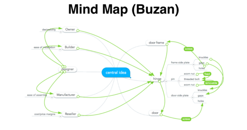
I'm not a fan of Buzanian Mind Maps. They are simplistic and just plain wrong. The "science" upon which they are built is not science but one man's selection bias and a lot of really well-executed marketing. Buzan's insistence that the mind thinks radially is just plain wrong and his evidence (a bunch of radial patterns in nature) is laughable and a near perfect example of selection bias (read his book Mind Maps). But why am I so down on Mind Maps? Well, like PowerPoint, Mind Maps mislead people into the false understanding of how their brain works and lead them to making errors in thinking and communication. Hundreds of thousands of children are being taught bad thinking habits everyday because of Buzanian Mind Maps. Those children will grow up, become adults, and unleash their lackluster thinking skills on the world around them. Buzanian Mind Maps emphasize hierarchy and force radial thinking. Hierarchical thinking is not problematic as it is merely the same as part-whole thinking. Where hierarchical thinking becomes a problem is when it is the predominant thought pattern used, it leads to thinking "cul de sacs" as there is only so much you can do or understand about a think by breaking it into parts. A Buzanian Mind Map uses lines (which are typically used for relationships for part/whole relations. Part-whole is better shown by size, as we can see in nature itself--parts are smaller than wholes. The concept of relationships (the green arrows in the above map) was never part of Buzan's original concept of Mind Maps--they have been added after the fact by software programs but they are low fidelity and only a few can be used before the map starts to lose meaning visually. Perspectives do not exist in Mind Maps, despite their constancy in the real-world. I used the after-market relationship lines to indicate perspectives, but there is no distinction between the green lines that make up the perspectives and those that make up the relationships. Finally, one other criticism that isn't evident here is the "creativity factor" of Mind Maps. People seem to love Buzanian Mind Maps because they are so "creative". This is because Buzanian Mind Maps often use color as decoration. The creativity that people perceive in Mind Maps is an impostor, a sham. Don't believe it? Take a look at "org charts are not creative" here.
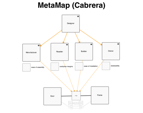
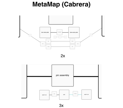
What you can see is that all three maps can be used. Yet, the map that most resembles the real design challenges of a hinge is the MetaMap. A hinge is a relationship between the door and the door frame, which the MetaMap shows handily. It also allows for perspectives (the four stakeholders of the hinge) and even second order perspectives (designer taking perspectives of others on the design of the hinge). those perspectives can be broken down into parts that identify the things that are most important to the various stakeholders. While this is a much cleaner and more realistic representation of the situation, where MetaMap really shines is in its ability to go to any level of detail and scale and represent real-world structure (thus it's quite good at representing reality). In the images below (which are merely zooms of the map above, we can see a great example of this scaleable "embodied cognition." In the MetaMap above, we see that the hinge is the relationship between the door and the door frame. But at 2x zoom we see down one level into the parts of the hinge itself. We see that the hinge is made up of two plates and that the two plates are related by a pin. The plates themselves have some parts (the knuckles and gaps) which relate to each other. The plates also have holes (which need to be designed) and those wholes actually relate back to the frame and door by another relationship: a screw. MetaMap allows the designer to zoom in further on any of these objects, deconstructing the screw into design elements such as the thread, head, length, etc. At 3x magnification we can zoom in even farther and see that the pin (which is the relationship between the two plates of the hinge which in turn is the relationship between the door and doorframe) is made up of a rod and two acorn nuts, but that the relationships between these nits and the bolt are importantly distinct: one is fixed and one is removable.
The point is this: Because DSRP is a model of embodied cognition based on how the mind actually thinks thoughts, it doesn't get in the way of you thinking thoughts about reality--which is also embodied. MetaMaps are designed based on DSRP. DSRP is simply, how we think for all types of thinking. Design Thinking, specifically, poses some great challenges because it almost requires (to a large extent) that the thinking actually gets manifested in some way (either produced, manufactured, created, printed, built, etc). This means that the central dilemma of design thinking is to reconcile the paradox of cognition and embodiment--e.g., building thoughts that lead to building stuff (not that design is always all about stuff but its always about manifesting something real; real relationships in the real world, etc). If I am right that design thinking is fundamentally about bridging the conceptual world with the real-world, then MetaMaps can help us think better about how to "embody our cognition" using embodied cognition.
- Explore a dynamic version of the "hinge" Plectica Map here.
- For more on embodied cognition and DSRP read this paper: The Right Brain/Left Brain Myth
- Also, Tufte's, The Cognitive Style of PowerPoint
.png?width=150&height=150&name=CRL%20GOAT%20Logo%20(4).png)
